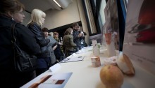
Exhibition 2010
Today was the exhibition launch for the Mid Sweden University’s final work on the Sensai project.
Today was the exhibition launch for the Mid Sweden University’s final work on the Sensai project.

This is the final result of Jimmy Norén and Robin Brinck’s sustainable packaging solution for Kanebo’s European brand Sensai.
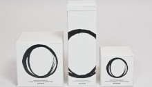
This is the result of our hard work during these last four weeks. Our packages are inspired by the simplicity of Nordic design and the Japanese calligraphy. We wanted to keep it simple and clean and make it look luxurious. Our symbol on the front of the packages is both a zero and a circle.…
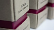
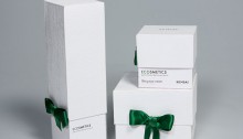
This is our final result of the four week project with the Kanebo redesign. We named our concept The Straight Path, which symbolizes the more eco-friendly approach we would like to incorporate in the Sensai line.
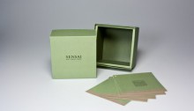
The old story about the Japanese hero Momotaro begins with his parents eating from a peach they found floating in the river. After eating from this peach they rejuvenate (the same thing that Sensai wants to achieve whit their products) and due to that their son, the hero Momotaro, is born. The other source of…
It’s been 4 weeks since the task of developing a concept for the new Sensai-line was presented to us. 4 weeks of thinking, cutting, printing, laughing, trying, and trying a little harder. This concept is what came from it.
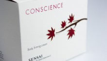
Here is the result of our four week project in designing a new package for Sensai. We’ve named the new line Conscience and the concept is based on the emotions you feel when you buy a product that cares for the enviroment, it will give you a clean conscience.
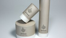
Kanebo decided to remove all the petrochemical ingredients in their products, creating a new serie within the Sensai brand. We wanted to activate the costumer to act in the same spirit, to help nature maintain and rebuild itself. Therefore we created these tree-like packages, to effectively communicate the ecological message. To inspire the costumer even…
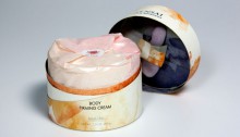
After these four weeks of hard work we have now made it to the finish line. We named our concept “Mulberry Silk” because of the mulberry leaves we used as an important symbol of our new design. The silkworms that produce the silk only eat mulberry leaves and that is our story behind it. We…
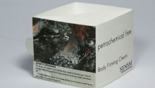
The packaging project is now over, and this is the results of Michael J and Patrik O. The picture bellow is the packing solution we have made up for Sensai’s new petrochemical free product line. We pushed the petrochemical free to it’s limit by reducing and simplify the packaging, and communicating the idea of less…