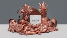
“Fruitography”

How to capture the sense of different flavours was one of our biggest challenges. Since one of our brand colour is copper we wanted it in our ad as well. So if we were gonna spray the fruits with copper…will it still “taste” like chocolate?.. And we wanted to make an ad that really stood…

Starting to look like something!

Hi! We made our own deadline schedule the very first week and we have really stuck to it. As we hoped we made our first print yesterday but as we expected it can’t work perfectly the first time and our second is getting printed as I write. Hopefully it will be flawless! #fingerscrossed Happy Friday!

Blast from the past…

Last weekend we took a tour down memory lane. Since we wanted a metallic foil to our logotype things could get a bit complicated, for some… But we had the some luck because Micaelas dad have a foil printer. So she went back home to Kramfors and started up the old macintosh from -97. Might…

Letterpress in plexiglass

Hi! This week we’ve been making a letterpress in plexiglass in the laser machine for our packaging. It was really interesting and our brains got some great exercise while trying to make the mould fit perfectly. So now we are really excited to try it out and press it next week in the workshop. We…

M&M

Hi everyone! We are Martina and Micaela and we are studying the first year of graphic design in sundsvall, Sweden. These next few weeks assignment is to make a packaging for a locally produced chocolate. All between branding, shape of packaging and design manuals. And so much more. And don’t forget all the choices of…