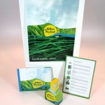
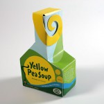
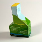
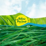
This is the final result of Annie Palmgren and Lisa Mörtberg’s project, promoting Ärtsoppa (Yellow Pea Soup) as the official national dish of Sweden.
Dish
Ärtsoppa (Pea Soup) has been a traditional Swedish dish at least since the Viking era, at the same time as it is contemporary: Swedish people of today like healthy, ecologically friendly and locally produced food. These qualities makes ärtsoppa a good representative of Sweden.
Brand
Saltå Kvarn is likely to produce ärtsoppa. It also has a well-known graphic design that has a genuine Swedish touch. Because of its successful design, it has never been necessary for them to promote their products in commercials, which makes this company interesting and challenging to work with.
Target Group
The primary target group has a medium income, and consists of single households of beween the age 20– 30 years.
We believe these people are looking for the following attributes when purchasing groceries:
- Ecologically produced
- Healthy
- Easy to prepare
Scenario
The soup is suitable for lunch and dinner, at work or at home and in any situation when you are in need of a quick meal – fast food in a more sophisticated way. The dish will be sold in most major grocery stores, along with the other products from Saltå Kvarn.
Concept and Strategy
The design strategy is to communicate that the product is genuine and natural. Saltå Kvarn is a trusted company and the idea is to reflect this customer relationship in the design. The design should communicate playfulness and personality. The colours are fresh like in the Swedish summer to make the box look new and trendy, as well as saying that the content is all natural.
Packaging Design
The box has an interesting shape that catches the customer’s eye. Many people in Sweden probably recognize the Saltå Kvarn logotype and know of the company’s values. The message can be read even from a distance.
Graphic Design
The typography is hand made to create a personal, genuine feeling and we use a form of collage in the landscape that has a creative touch. The KRAV label, which is a national certification for ecological food, is clearly visible as we know our buyers are looking for it on the shelf.
Advertisement
In the advertisement, the landscape on the box is a part of a collage landscape made of ”real” natural elements. The message is that the content is all natural, and in the advertisement this becomes concrete.
Brochure
We wanted a playful, creative touch and had a childrens book in mind when designing the brochure. We also wanted to show the whole process, as we learned a lot from it.
Download brochure as pdf.


