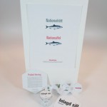
This is the final result of the project with the Pickled herring and crisp bread. Enjoy!
Fannie and Elina
Dish
We chose Pickled Herring for our National Dish. We chose it because it’s not a regional dish, it’s eaten over the whole country. Pickled herring is usually enjoyed with crisp bread and/or potatoes. In our case we have chose to serve the herring with two slices of crisp bread, it’s a hard bread with lots of fibres.
Brand
The trademark that we chose is named Hemköp, it is a grocer’s store and we plan to have it as their own product. The trademark has a trade-contester (ICA) that already has products that is ecological. We want to bring some competition to ICA and other stores when it comes to the ecological food.
Analysis
We went to Hemköp and looked at the Herring shelf so that we could find which colors and shapes the other brand was using. It was mostly blue, pink and other bright colors, so we decided that our box would be slightly grey (4 % black), that way you will see it easier.
The targetgroup is women that is closer to the age 30 than 20. They live an active life and healthy food is important to them. The reason why we choosed women is because we think that they are more particular when it comes to what they eat when they wan’t to stay in shape.
Strategy
We made a schedule for what we were supposed to do every day. We followed it very particularly and that resulted in extra time to make adjustments in the end.
Scenario
Our product will be placed in two different places in the store. One of them is together with the other pickled herring amongst other brands and the other place is next to the fresh fish. The target group will buy it before or after working out.
Idea
The idea behind this project is that we want people to live more healthy but still have the opportunity to eat really tasty food. We think that more people will eat fish thanks to the design of the box. It’s easy to eat because you won’t need a microwave or oven, all you need is a fork!
Box
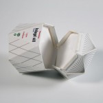
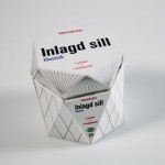
Our design for this box started with the simple idea that we wanted to do something unusual. We chose to have the lid and bottom with the shape of a hexagon and then build up the whole box with straight and angular forms. We then wanted to make use of that to give the box illustrations of herrings. We want the buyer to sense the herrings in the box.
Ad
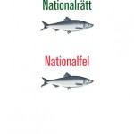
The ad symbolizes the big amount of sugar that other pickled herring contains. It’s a picture with two herrings that looks just like each other and above them it’s a text that says “Nationalrätt” and “Nationalfel”. We have played with the words here because the last part, “rätt” means both right and dish. Therefore you can read it both as National dish and National right. Under that it says National wrong.
We have a text under the Hemköp-logo that explains the picture. The fish might look the same, but the difference is that one of them contains sugar and the other doesn’t. National dish/right refer to the fact that the national dish is right because it’s healthier for you.
Brochure
Download brochure as pdf


