
After five weeks of intense Sushi packaging, this is Sofia and Maria’s final result – the Hinomaru Sushi package.
Dish
We chose Sushi because it didn’t exist any luxurious alternatives on the market. Sushi is already well-known in Sweden, but it doesn’t feel as Japanese as it could be – it’s more or less just fast food. Because of this, we wanted to bring the Japanese feeling into the Sushi package.
Target group
Since our package is an expensive and high class alternative, we think that our target group will be Sushi enthusiasts with well-paid occupations. Our target group more specifically consists of business women in the ages between 35 and 45 years. However, our package has a classic look, so we think it will appeal to all ages and genders.
Scenario
Our package will be sold at convenience stores and supermarkets. It will be bought as lunch during hectic days, when fast food is needed but the consumer wants to avoid bad quality and unhealthy alternatives. Our Sushi will also be a solution when the consumer doesn’t have the energy to cook at home when coming home from a long day at work.
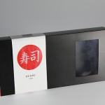
Packaging design
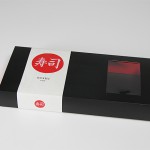
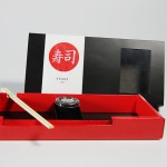
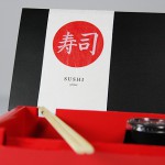
Our package has a rectangular shape, with a sliding lid. Surrounding the lid is a white strip, where all the mandatory information is displayed. The strip is made of a Japanese paper called Unryu – a paper with a fine texture to give it a handmade impression. The fundamental cardboard is red, and is made of thick Invercote for stability. The lid and the bottom plate are made of water resistant material. On top of the box there is a small window, to give the consumer a small view of what’s to come. It will also show the consumer that the Sushi pieces are fresh and of good quality.
The package also features a chopstick holder, where you will find the chopsticks when you open the box. While eating, you can place the chopsticks at the chopstick rest, so that the chopsticks doesn’t get dirty.
The design
When making our packaging design, we were inspired by Japanese minimalism. The design is displayed on the white strip. The white background and the big, red dot symbolizes the Japanese flag (called Hinomaru, hence our package name). Inside the red dot are the kanji for “Sushi”. Take Mikado’s logotype is featured on the back of the package, along with all the mandatory information. We wanted a clean primary display panel, to convey a feeling of exclusivity and minimalism.
Advertisment
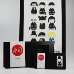
In our advertisment, we wanted to twist something typically Japanese into something Swedish. Thus, we illustrated typical Japanese dolls, and made them into stereotyped Japanese business women and men. All the dolls in our poster is glancing towards a Swedish version, holding our package. We wanted to give the impression that Take Mikado’s Sushi is “at least as good as in Japan”, and that even the Japanese will be jealous of such high quality Sushi.
Brochure
The brochure is a scaled-down version of our Sushi package. The text is featured on thick cardboard cards and the illustrations display the dolls used in our advertisment, along with blueprints of our package.


