This is the result of Karin Jenskog and Sara Modigh’s project, promoting sandwich cake as the new national dish of Sweden.
Dish
Sandwich cake could be described as a very rich sandwich with so much filling it resembles a cake. It is possible to have great variations in the filling to accompany most peoples taste. It is a popular party dish and is not to be confused with smorgasbord.
Brand
We chose to work with Gooh!, a new fast food company that focuses on quality and health. It is a collaboration between Operakällaren, a luxurious restaurant in Stockholm, and Lantmännen, one of the finest distributors of raw materials in Sweden. Dishes from Gooh! are minutely supervised and selected by Stefano Catenacci, executive chef of Operakällaren. All raw materials used by Gooh! has been produced at swedish farms, which makes it possible to control almost all ingredients
Target Group
We decided to target a group of people aged 20-30 years old, working, with or without a university degree and who care about their lifestyle, making active choices, trying to profile themselves. They are cultural, social, creative and outgoing and they value spending much time clubbing, having coffee with their friends and meeting new people. They have a creative job that they like and they prefer a job that is important to them with good colleagues over a higher salary. None the less, they are not low-paid, they have the money they need to live their lifestyle.
Scenario
What positions our sandwich cake from its fast-food competitors is the scenario. We have chosen to work with a picnic scenario because it shows how easy it is to eat this dish wherever you please. In the park with your friends, at work, while on the road or at home when lacking inspiration to cook something yourself.
To reach our target group the dish will be available not only at ICA, Hemköp and other larger grocery stores but also at 7-Eleven, Pressbyrån and at gas stations. Preferably in the fast-food section. This is because our target group is constantly on the go, trying to do as much as possible simultaneously to save time.
Concept
Our concept is to make our sandwich cake an alternative to fast food and boring salads and baguettes that you might usually buy when in need of a quick lunch. We wanted our target group to feel that our dish helps them in their everyday-life and gives them more than satiation in return.
So, to get the most out of the packaging we decided that it not only would serve as a container for the food but also a kind of plate. To that we added knife and fork so that you only have to buy our sandwich cake and something to quench your thirst with to have the perfect picnic.
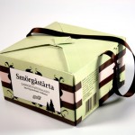
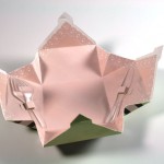
Packaging Design
Our packaging demands a lot. It is important that it is easy to bring anywhere and to eat out of/on. From these aspects we have created a packaging with the simple shape of a rectangle. This makes the boxes easy to pack and stack upon one another to help transportation and storing.
You open and close the box by attaching or unattaching two pairs of flaps on the top, a construction that makes it easy for the consumer to open and close the box several times. The packaging is also completely symmetric and flat when it is open, which makes it easy to eat out of it.
Graphic Design
We created a graphic design that we believe will attract the target group and also symbolizes Sweden. We have several Swedish symbols on it, but as they are only silhouettes it does not feel Swedish in a traditional or boring way. The stripes on the box in brown, green and pink, represents the layers of the sandwich cake and helps to distinguish our product from its competitors. We chose the brown, green and pink for the stripes to match the colors of the layers but on the packaging we have worked with tint and saturation to make the colors cooler and a little more elegant.
The packaging together with the classic centered typography creates a feeling of tradition but with a modern touch. To illustrate the traditional swedish picnics we have made the inside of the packaging resemble a tablecloth. The color is the same nuance of pink as on the stripe on the outside of the box.
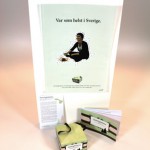
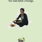
Advertisement
The idea with our advert is to show how easy it is to have a perfect picnic wherever you like by letting the viewer use his or her imagination to create a background or location in his or her mind.
Brochure
We made a simple brochure with the same proportions as the package. It also has the same coloring and illustrations as the package. Inside it is clean and simple and we have once again used the illustrations from the package.
Download brochure as pdf.


