
This is the final result of Caroline Johansson and Linus Wijk’s project, Plättar – small pancakes.
The Dish
Plättar is a small version of pancakes. They are very typical of Sweden, and are served with blueberry jam and whipped cream. The reason why we chose this dish as the national dish of sweden is because these small pancakes feel very typical of Sweden. The colours of the dish are also very Swedish, yellow and blue!
The Brand
We’ve chosen Familjen Dafgård as our brand. The reason why we chose this brand is because it feels like a genuine familyowned swedish company. We also think they have a clean and personal visual language that fits the swedish people. Familjen Dafgård recently put a lot of work on ecologic one portion dishes. We have also noticed that they don’t have pancakes in their range.
Target Group
Our target group are people on the go whos in need of a quick meal, ready to eat as soon as possible. That is why plättar are a great option, you can eat them cold as they are or heat them up in the microwave. A typical person in our target group is someone between the age of 20 and 30. This person is someone with a tight schedule, maybe a student or someone who is early in their career. Someone who thinks that money is important, likes to work out and someone who is on the go!
The Scenario
The scenario is rather wide. The great thing about our dish is that it can be eaten hot or cold and it can therefor be consumed both indoors and outdoors. A microwave is not necessary. The scenario is basically a crowded lunch-area. It could be the Uni-cafeteria, a bench in a park or perhaps the lunch-room at your work-place.
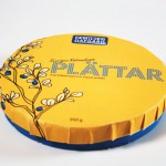
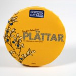
The Package
The package is round. And it’s yellow. It has the same shape as a small pancake. The package will contain 21 small pancakes, jam and whipped cream. The shape of the lid is formed to remind of the lid of a homemede jamjar. When opened the package is a perfect little plate, and you can eat right away.
The Design
We have used the sign of our dish to make the design of our package. The sign is the circel, more precise it is a yellow circel. When we developed the design we decided to use our signs as much as possible. Thats why the background is yellow, and the word “plättar” is written with a dotted font. So even the font is made by our sign. We also made an illustration of a blueberry twig, simply because we wanted to get a more playful and organic touch.
Download our brochure as pdf.


