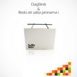
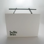
Emil and Thobias are now finished with the sushi box. The briefcase look are finally completed and this is the result.
Dish
After studying the menu of take mikado in the beginning of this project we decided to go with the dish sushi. We thought that it would be the most interesting and the most funniest challenge to try packaging. Sushi is the most known japanese dish and it is getting more and more appreciation in Sweden but we wanted to speed up that process with a package that would give an impression of freshness and would get the consumers interest.
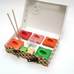
The packaging of sushi today in the swedish are really dull and they all look the same, a black bottom with the sushi divided by small “walls” and a plastic cover over the package. This would be a fun task to try go against this trend in sushi-packaging and go the opposite way we thought. Our package contains 6 pieces of nigiri and 6 pieces of maki.
Target group
Our target audience includes businessmen and businesswomen who are 25 – to 50 years and is a medium-or high-income earners who can afford it and want to spend 150SEK for a bit more luxurious sushi in a luxurious package. We thought it was one of the markets where demand for sushi is greatest.
Scenario
Instead of going out and having a lunch meeting they now have the ability to bring lunch back to the office, where you have the opportunity to make a complete presentation of such conference room while you eat lunch. The advantage of our package is that it contains everything you need to eat sushi, you do not have to do dishes and can be eaten directly from the package. You can also easily split portions and set up a small Japanese smorgasbord. The idea is to make the package more attractive and exciting than today’s dishes you can buy in the supermarket which you do not like to offer, at a lunch meeting.
Packaging
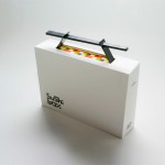
To attract our target group the package is similar to a briefcase with a white rectangular shape and a black handle. It contains 8 small boxes, five of them contains sushi and the other 3 contains wasabi, ginger and soy. We have also included a folded plate and in it you will find a napkin when you unfold it. The handle to the big package works as 2 things. First it makes the package easier to carry and second it contains the chopsticks. The chopstick container got a “tear-of” function so it will be easy to get the chopsticks out of the box.
The wasabi and ginger container got the same “tear-of” function. When it comes to the graphic design of the package we wanted to keep it clean and stylish. We chose a white color to the big box to represent freshness and the color helps it to stand out on the shelf in the store. Not to much graphic either on it, just a logo we designed for the product and some text on the backside.
The sushi containers we wanted to have bright, popping colors taken from the food itself. It makes a interesting and fun contrast to the white of the rest of the box. The rest of the small boxes got colors depending on its content except the soy container who is made in plastic so you can se how much soy you got left. Instead of using a plastic window on the small boxes to se what they contain we chose to work with pictograms instead. Each box got a small symbol of what they contain, salmon, crab, prawn etc. We made a pattern of the shape and color of the small boxes inside and used it on the big packaging.
The logo also is inspired and made of shapes of the small boxes inside the big packaging. We used Invercote 330g/mm and 280g/mm for our package.
Contact information
Thobias Lofqvist
Thobias_85@Hotmail.com
Emil Palm
Emilpalm87@Gmail.com


