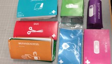
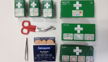
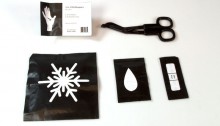
Introducing Black Label

Last Friday was the grand finale and the time for the presentation! We felt happy with our prototype, in both the design and the functional part. Pitching Black Label In the presentation we started of with a market analysis to show how the market looks today, then continued with our idea; how we think the…

detail shot on the designed cross

Första Hjälpen-Kitet

For 5 weeks we have had the opportunity to work with Cederroths First Aid Kit. We were to create a new scenario where you might need one. We decided on making it a gift, as we discovered that few actually owns one. To receive a First Aid Kit from someone is a sign of solicitude,…

Close up of the label on the gift bag.

Lucky number 7

The first examination is behind us and we have embraced the constructive criticism from our teachers so there’s been quite a few changes and developing done the last few days. We’re now going to focus more on the idea of this kit being a present, both in marketing posters and pitch. We have made different…

New placement of the products

Colors – for a positive feeling

Since our last update we have been developing the design of the package. For the products we have made C-sketches where we want to create a positive feeling by using different colors for each product. We are creating a pattern of the product colors, that we will use balanced through our packaging design. For example…

Fresh and young, practical and healthy

Our scenario is a first aid kit that is easy to carry with you in your everyday life. The target group is young people aged 18-25. We believe the kit should be more portable to make the target group want to carry the kit with them all the time. Our thoughts on the kit is that it should be able…

Prototype

Prototypes of an Interior-hero

This week we have focused on prototypes, sketches and to develop the main concept, that we talked about last week – and what was it now again? Creating a product that will make your home both safer and work as an interior piece – the hero in your home. How are we going to do…

Challenges of function and form

Last week we decided our scenario, a housewarming gift, for Cederroths First Aid Kit. Now we have created a moodboard that shows the feeling we want to achieve with our design. The moodboard is based on the keywords we have chosen from the teachers list from Kobayashis color image scale – calm, chic/elegant and pleasant…

This is our working space. This is where we came up with our new prototype which changed our focus.

New track, new focus

If last week was about creating a concept and getting started, as well as recovering from the ketchup incident, this week is about putting new focus on a new track and keeping our own deadlines. Since last time we have had a lecture about color emotions. In connection with the lecture we created a moodboard…

Re-designing a lifesaver!

For the course Communicative Packaging Design we got the mission to re-design a lifesaver, also known as first aid kit, by Cederroth. Monday 6th October: We started by researching the company and its competitors by asking around in different public places, such as a sport center, a museum and stores. In the afternoon we created…

Products from Cederroth

Re-packaging First Aid

The project we have been assigned to do is re-package the brand Cederroth‘s first aid products. We are going to design a first aid kit in cardboard, and design a product based on a specific scenario and target group. We are focusing on both designing and marketing the product, seeing to the target group’s needs. Our…